Kitchen Kneads
Adding a dash of charm into a wholesome brand.
+ Project Story & Info
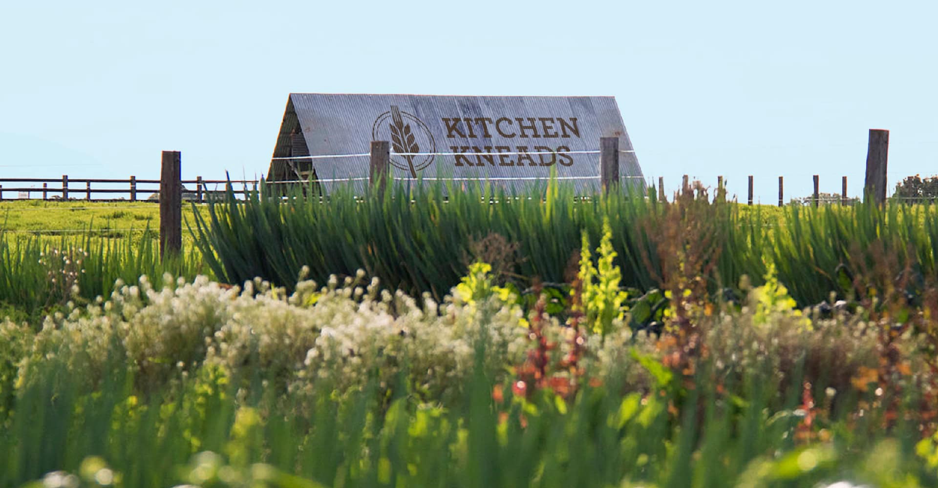
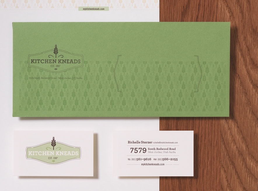
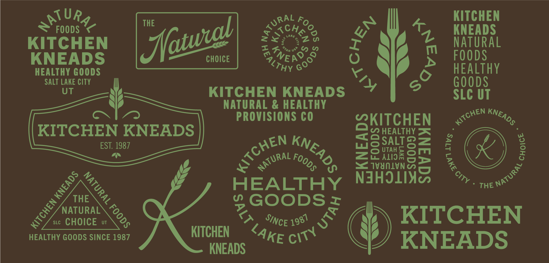
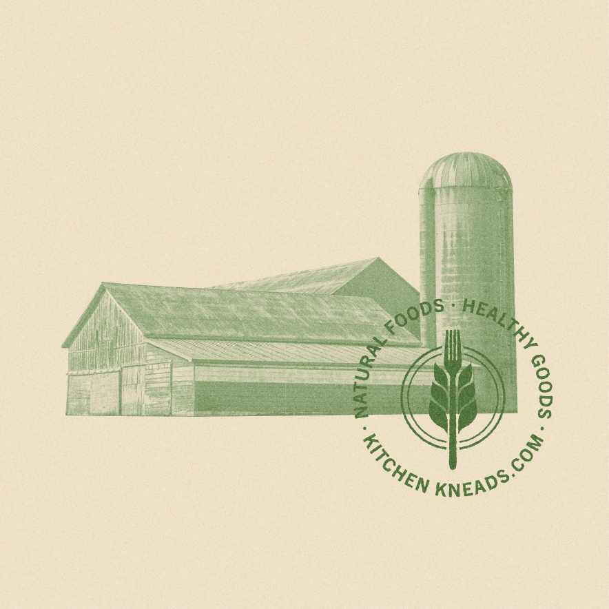
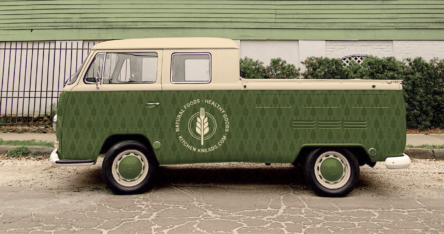
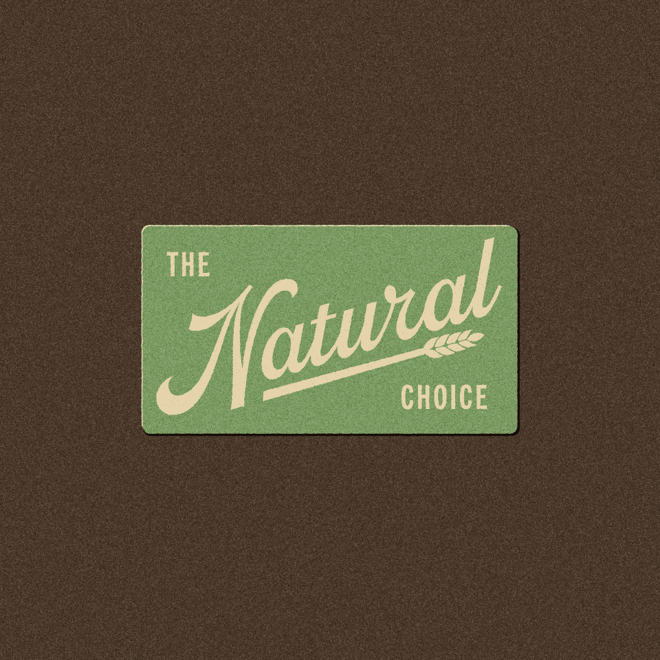
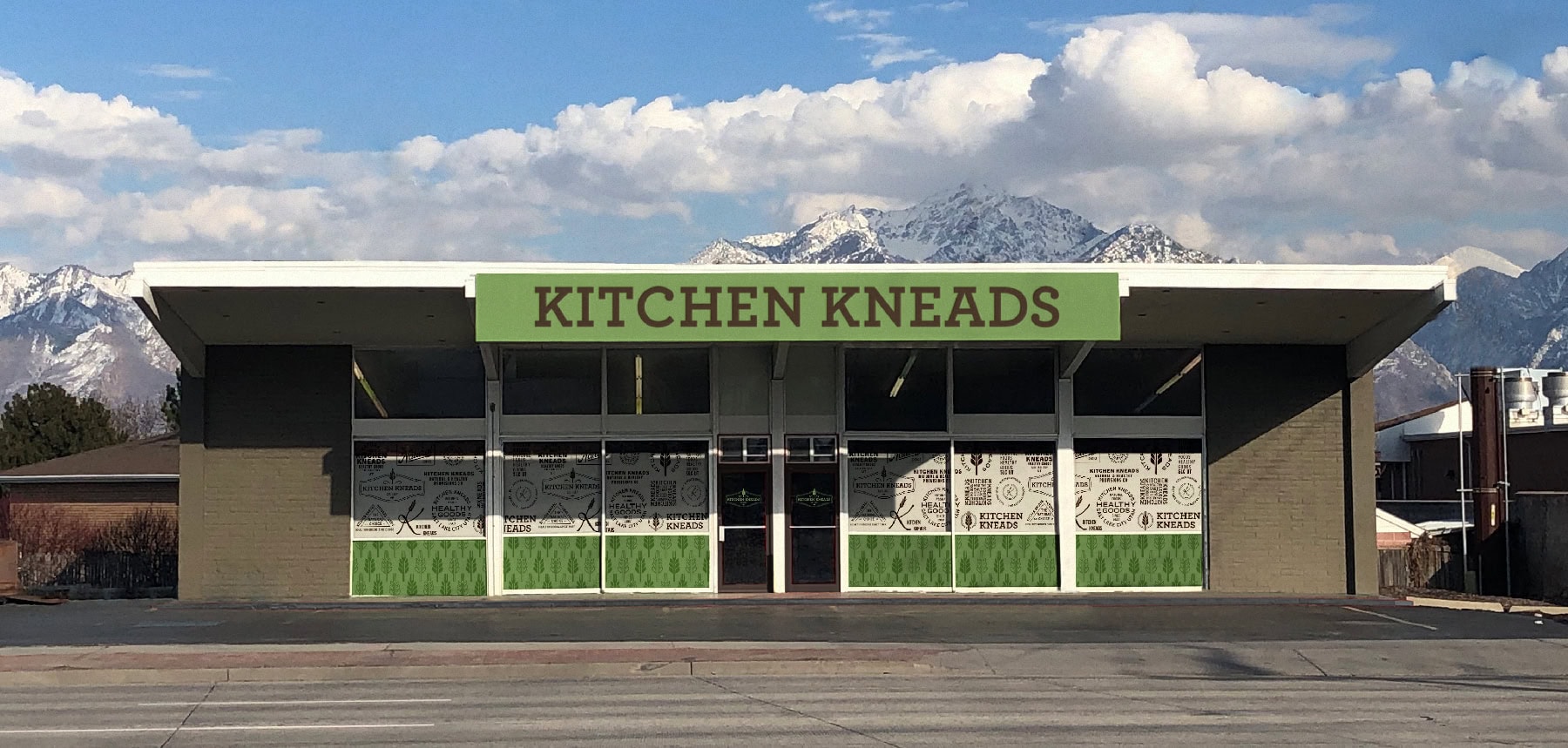
Kitchen Kneads was looking for that secret ingredient—they needed a way to reinvigorate their quaint healthy food and kitchen supply store, yet retain the nostalgic feel of a local fruit stand. With a pinch of vintage, a dash of contemporary, and a whole lot of great creative, the growing wheat-fork icon sprouted onto collateral, a new website, and throughout the rest of their wholesome brand.
Services: Brand Architecture, Print Design, Environmental Graphics, Website Design











Check out another project:
Kyle Harris Design is an award-winning
branding and design studio.

