Butcher's Bunches
Spread the love.

Healthy Portions of Illustration
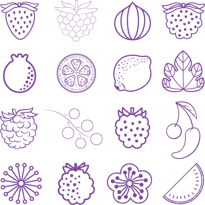
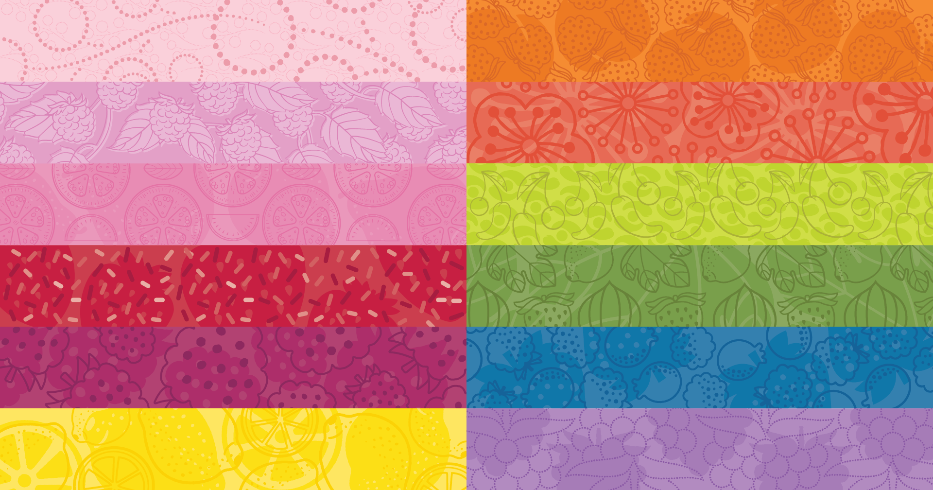
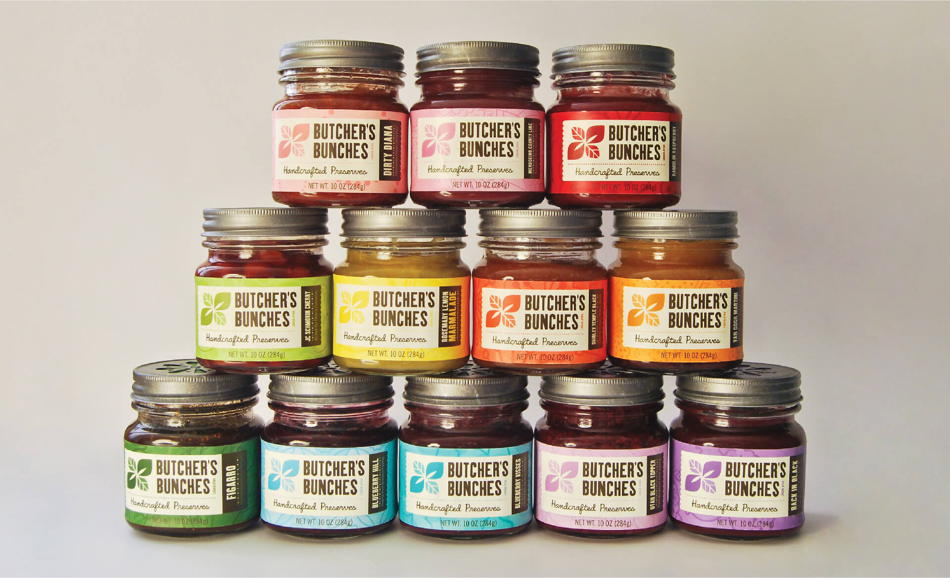
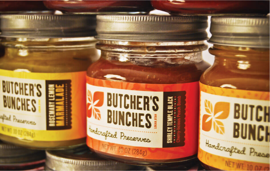
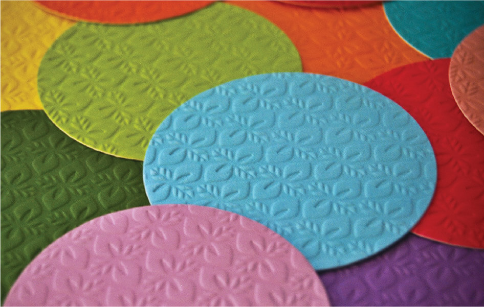
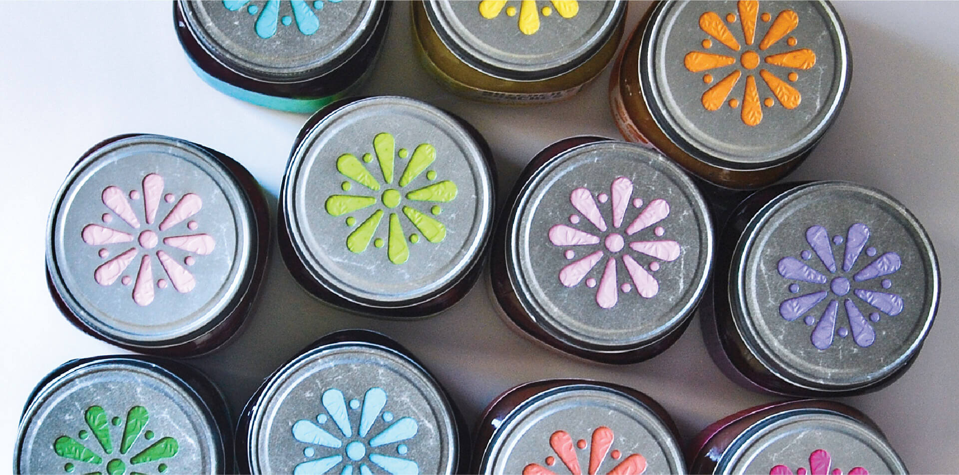
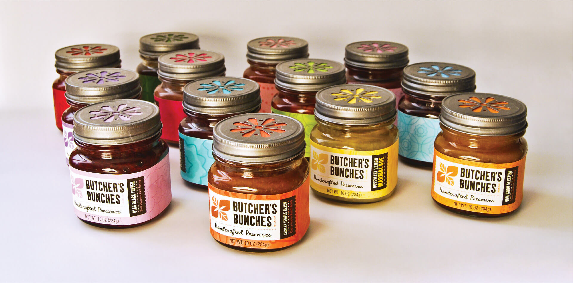
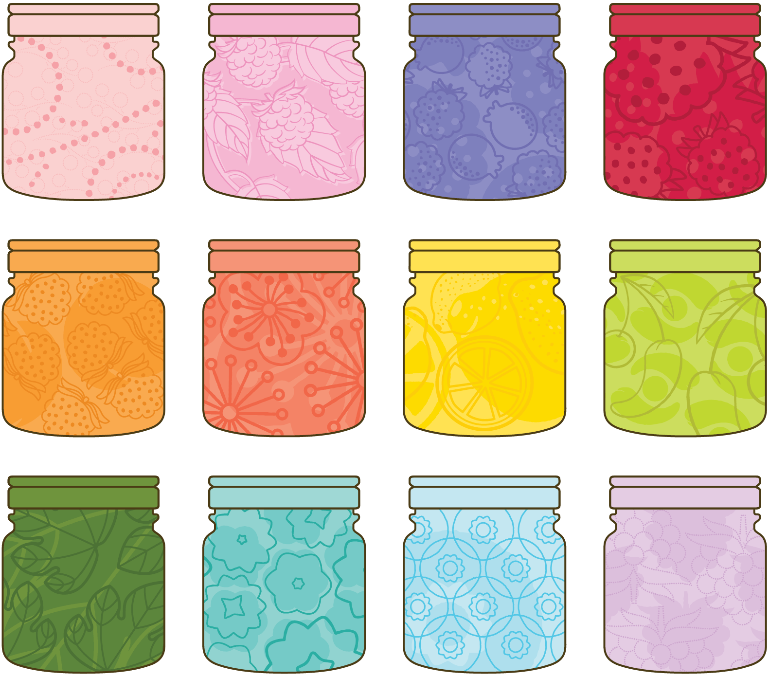
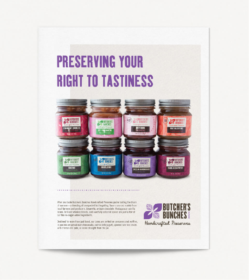
Custom illustrations of the product's natural ingredients are sprinkled generously throughout the packaging. One unique challenge we found along the way was how to illustrate the raspberry, a reoccurring ingredient in many of the jams, to not appear redundant. The solution was to use various illustrative styles and then harmonize the product line through color, pattern, and labeling elements, creating a packaging system that looks and feels as hand-crafted as the product itself.
Healthy Doses of Illustration
Custom illustrations of Butcher’s Bunches many natural ingredients are sprinkled generously throughout the packaging. One unique challenge we found along the way was how to illustrate the raspberry, a reoccurring ingredient in many of the jams in the product line, to not appear redundant. The solution was to create a broad spectrum of illustrative styles and harmonizing the product line through color and pattern, resulting in a product line that looks and feels as hand-crafted as the product itself.


Playful Tone
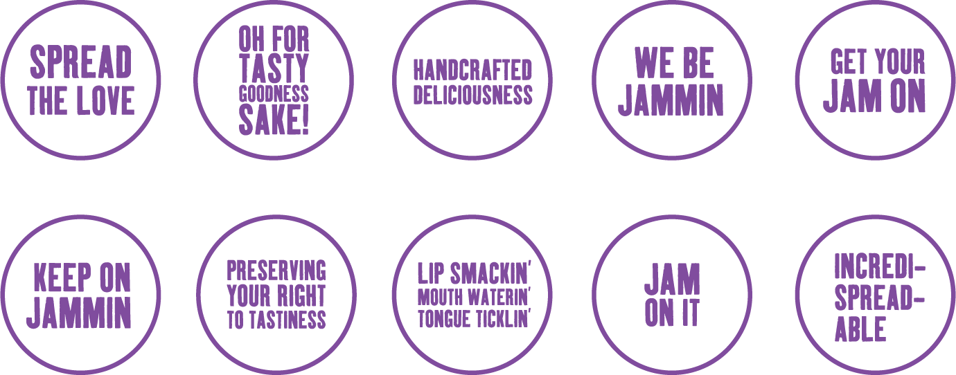
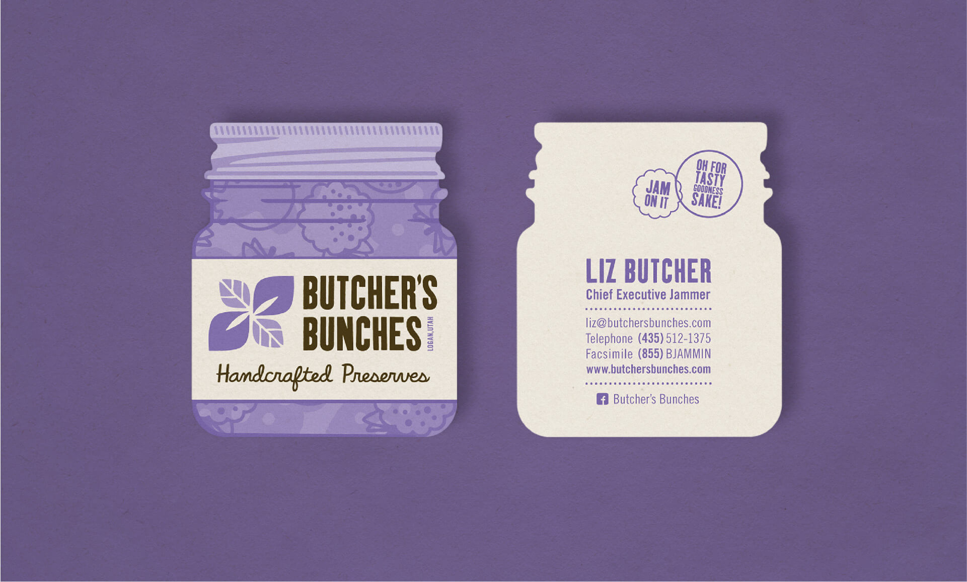
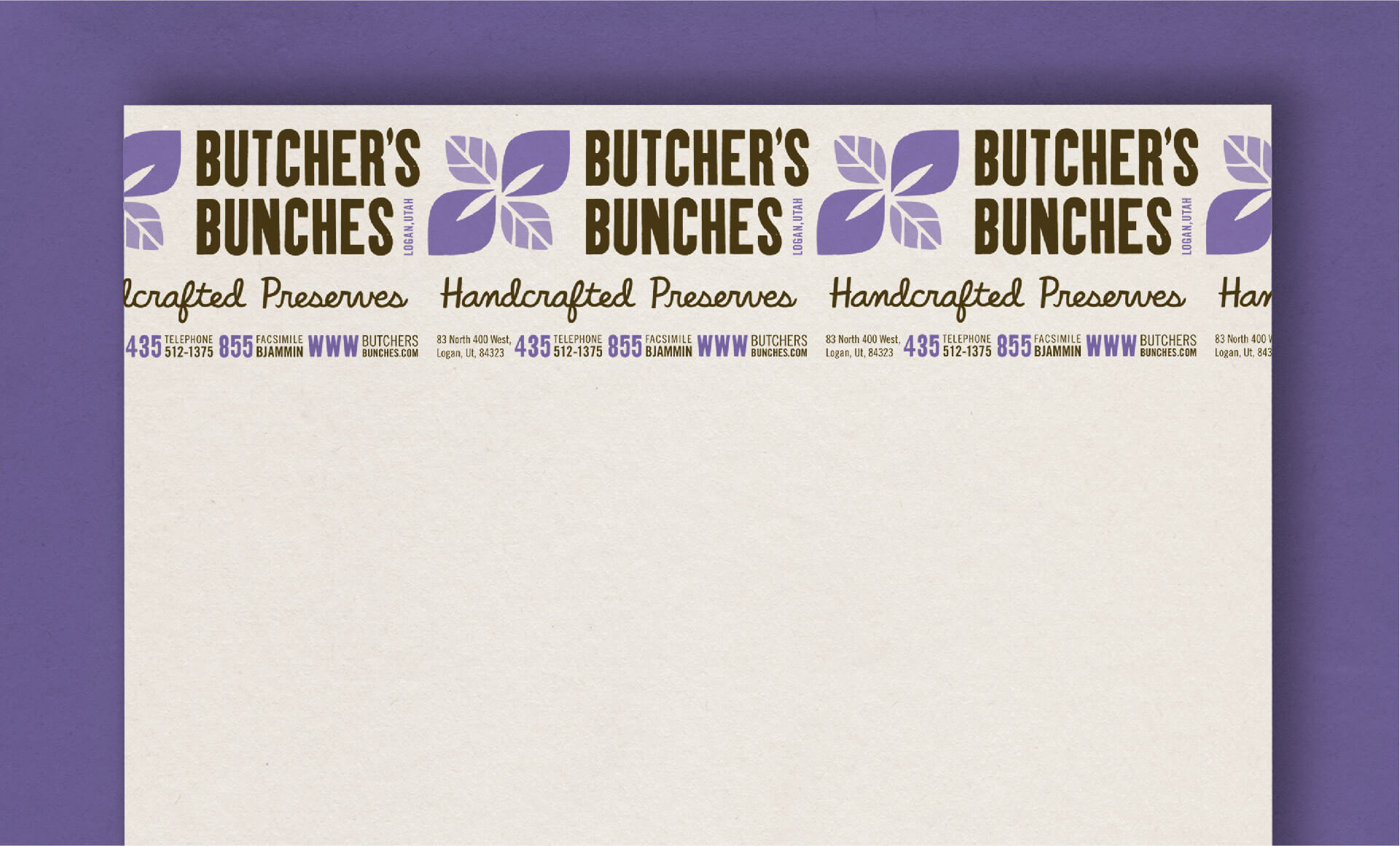
For Butcher’s Bunches, saying what they’re all about is just as important as showing it. To round out the brand, a witty and honest tone of voice was blended into every touchpoint. Everything from product descriptions, packaging elements, print collateral, environmental graphics, and their social presence speaks in this tone.
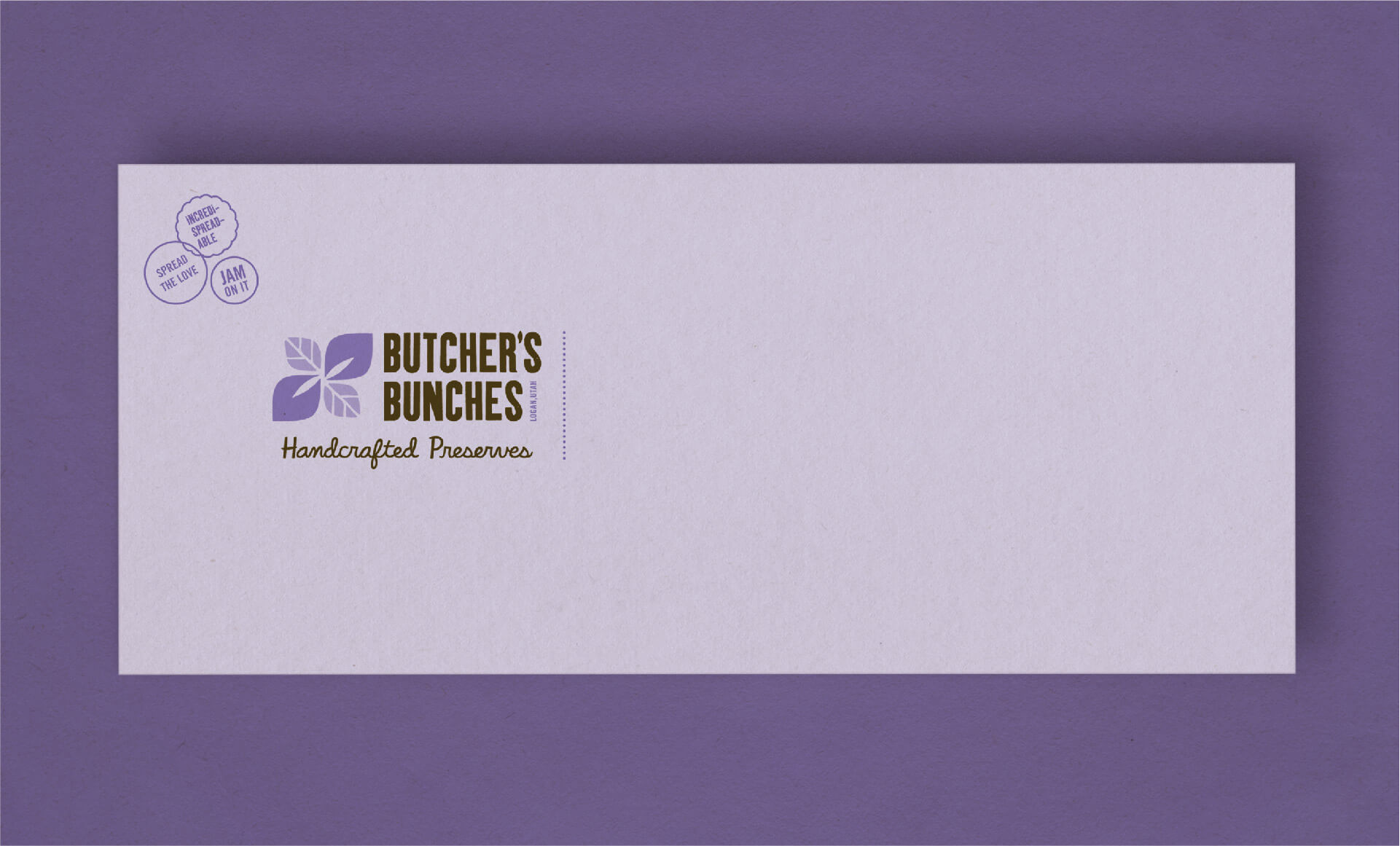
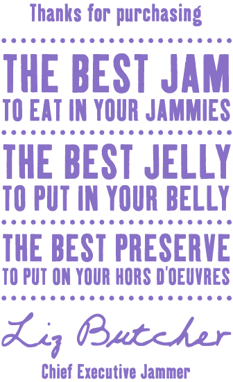
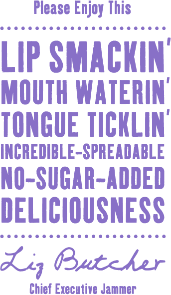
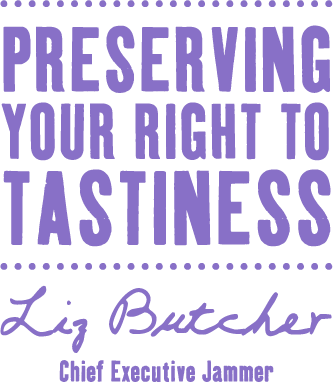
And for that extra personal touch, the ability to customize a message was needed. Stamps with quippy sayings about their craft were created and are applied wherever they feel an extra morsel is needed.
Check out another project:
Kyle Harris Design is an award-winning
branding and design studio.

